Why Color Belongs in Workplace Strategy From the First Design Meeting
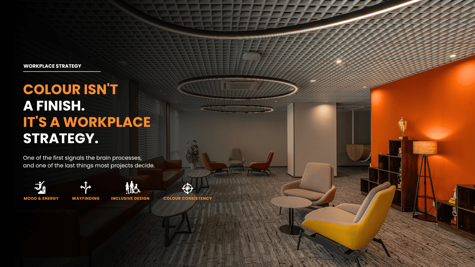
Color is one of the first things the brain processes in a space, and one of the last things projects decide.

The Sequence Is the Problem
In most workplace projects, color is decided last, after layout, materials and joinery. By then it can only complement what already exists. One of the most powerful tools for shaping behaviour ends up spent on decoration, because every other decision has already been made around it. The result is a palette chosen to match finishes, with little thought for what each space is for. Color is among the first signals the brain processes on entering a space. It shapes attention, mood and energy before anyone has consciously noticed the furniture. Something with that much influence should help shape the design from the start, alongside layout and lighting, instead of being picked from a shade card once the drawings are finished. Treated that way, color becomes part of the brief rather than the final layer.
Start With What People Need to Do
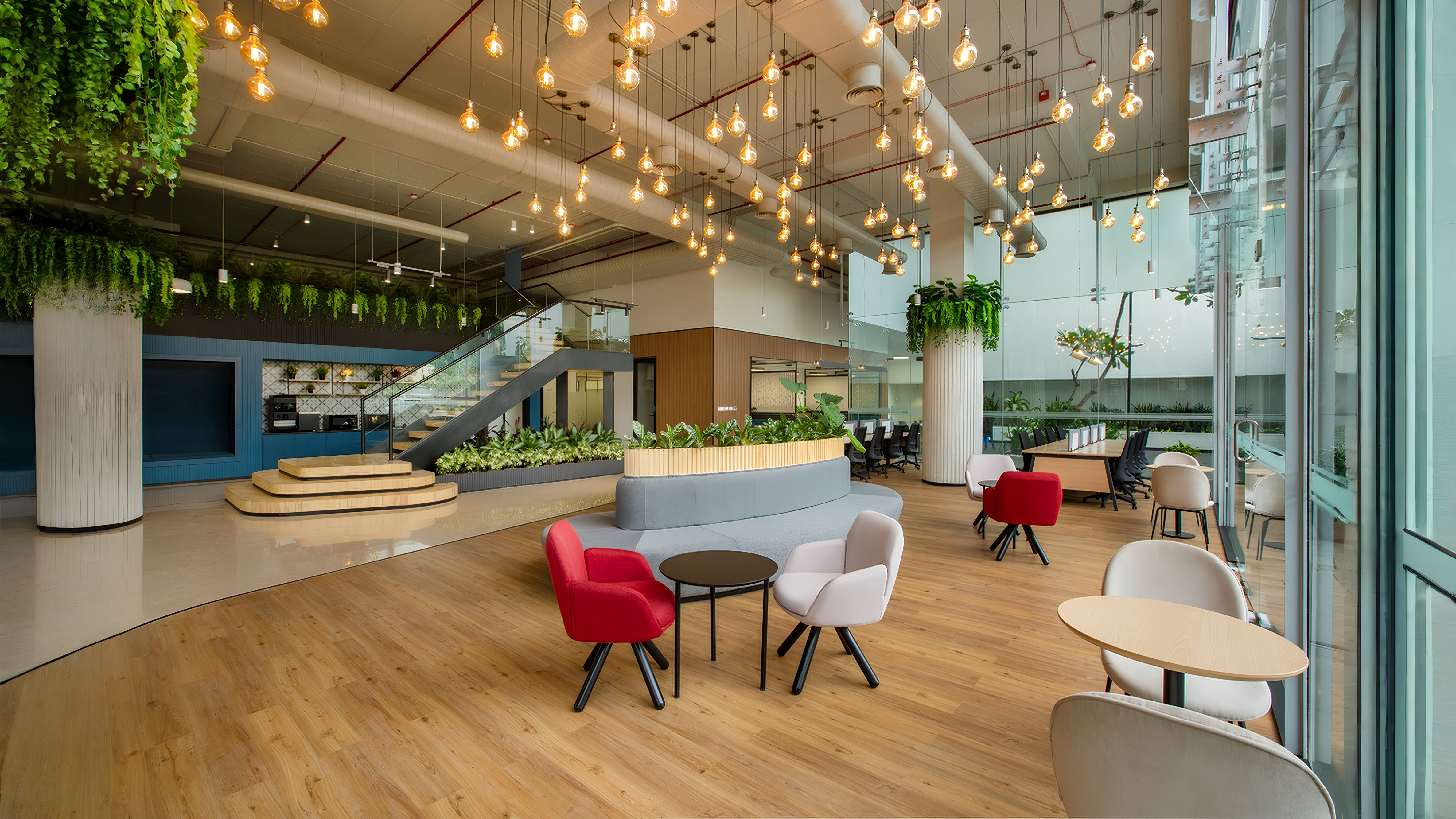
The useful question is what people need to do in a space, rather than which color looks good. That makes color answerable to an outcome instead of taste. A palette justified by behaviour survives stakeholder reviews that a palette justified by preference does not, because each choice has a reason behind it that people can discuss. It also gives the project team a way to settle disagreements that does not come down to personal taste. A focus zone, a collaboration area, a client lounge, a café and a wellness room each ask for different behaviours, so they should not share one palette. Differentiation has a practical benefit as well. It makes a large floor easier to navigate, because each zone looks and feels distinct from its neighbours. People can tell which kind of space they are in, and what is expected of them there, without being told.
What Different Colors Do
Blue supports focus and signals trust, which is why it endures in banking and legal settings. Paired with cool light and hard surfaces, though, it turns clinical. Green reduces mental fatigue, supports creativity and pairs naturally with biophilic design, which makes it a natural fit for spaces meant for sustained work. Orange encourages conversation, so it suits cafés and breakout areas where people are meant to talk. Purple supports lateral thinking and is underused. Navy conveys authority in boardrooms without overwhelming the room. Blue and green tend to work across large areas, while the stronger colors need more care. Each of these effects depends on how much of the color is used and where it sits. The same color can help in one room and work against people in another.
Area Colors and Accent Colors
Some colors work only in moderation. Yellow energises as an accent and tires the eye at scale. Red heightens alertness, which is useful for wayfinding and safety but too much for a whole workspace. Soft pink creates psychological safety for one-to-one conversations, so it suits small rooms better than open floors. Using any of these at the wrong scale produces the opposite of the intended effect. The core discipline is knowing which colors are area colors and which are accents. Most palettes that fail in execution fail at this distinction. The problem only shows at full scale, once a color that looked lively on a sample board covers an entire wall, and that is why mockups matter. A full-size panel on site shows in minutes what a sample board cannot show at all.
Light Changes Everything
A palette approved under studio light can behave very differently on site. A warm grey under 4000K reads cool, and under 3000K it reads warm. Color rendering, daylight and orientation all shift perception, so the same paint can look noticeably different on two sides of the same floor. Teams that approve colors only in the studio are approving something the building will never show them. Reflectance also affects lighting design and energy load, since darker surfaces absorb light that fittings then have to make up. Color and lighting belong in the same conversation. Reviewing samples on site, under the specified fittings, removes most of the risk at negligible cost, and it is one of the cheapest checks a project can make.
Wayfinding and Accessibility
People navigate by landmark more reliably than by signage. A consistent color logic across zones or floors lets them orient themselves without reading anything. Over time, the color of a zone becomes shorthand for where people are and what happens there. That helps visitors and new joiners most, since they do not yet know the floor. Color vision deficiency, however, affects roughly one in twelve men. Any system that carries information through color needs a second channel, such as contrast, form, position or text. Luminance contrast at thresholds and step edges improves legibility and safety for everyone, including people with no color vision deficiency at all.
From Palette to Delivered Space
The same shade in laminate, paint, fabric and powder-coated metal will not match without deliberate control. Batch variation compounds the problem across large floors and multi-site rollouts. Ensemble's 1,25,000 sq. ft. in-house facility produces color decisions under one accountability, instead of several suppliers each working from their own sample and their own reading of the approved shade. Without that control, a carefully chosen palette arrives on site as a set of near misses. Control has to run from specification through manufacture to installation.
Conclusion
Color is behavioural design that acts on everyone in the building, which makes leaving it until last hard to defend. Bring it forward, tie it to what each space should enable, coordinate it with lighting and control it through manufacturing. At Ensemble, across 1,900+ projects, color is planned as part of workplace strategy from the outset. The best workplaces use color to influence behaviour and performance, and the visual appeal follows from that.